Live Demo
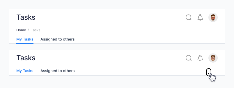
With Breadcrumbs
Without Breadcrumbs
Anatomy
The header spans the full width of the viewport and is the topmost element in the browser window. The header is persistent throughout the product experience. For each header, left-to-right translates to product-to-global. The left side of the header contains items relevant at the product level. Moving to the right along the header, the functions become more global. Elements in the middle of the header should represent system-level controls
For each header, left-to-right translates to product-to-global. The left side of the header contains items relevant at the product level. Moving to the right along the header, the functions become more global. Elements in the middle of the header should represent system-level controls

Admin mode
- Header base
- Page title
- Search
- Notification
- User profile
Normal user mode
- Header base
- LOG/ branding
- Home
- page name
- Create task button
- Search
- System directory
- Notification
- User profile
Interaction
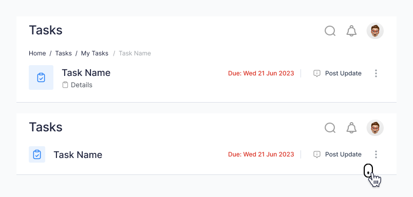
The interaction in the header is specifically designed to give the utmost information to the user while interacting with the application. For both the admin and normal user, the interaction remains the same although the visuals differ. When the user scrolls to view the content in the screen, the breadcrumbs are hidden and only the page title is displayed with the tabs below.
Primary header
Secondary header
Usage
Use a page header to create a consistent experience at the top of a full page. The page header provides the core information users need when viewing the page.
Guidelines
- Headings should be sentence case unless they include proper nouns.
- Headings should be short and let users know what to expect on the page.