Live Demo
I’m searching for
RecentUI/UX Requirements
Team Meetings
UX Challenges
Github Repo's
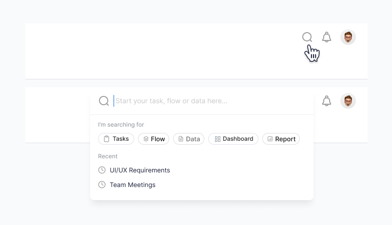
Anatomy

- Input field
- Instant Search menu
- Clear field button
- Filter tabs
- Recently viewed
The global search must be placed next to the notification icon in the header on all screens and is collapsible.It also contains filter options within the search for better search results
Interaction
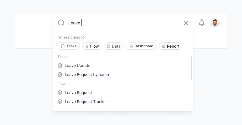
- The search bar should expand to the left and occupy the top right corner of the screen.
- Once the search value is entered, the recent search results disappear and relevant search results based on the value entered will be displayed there.
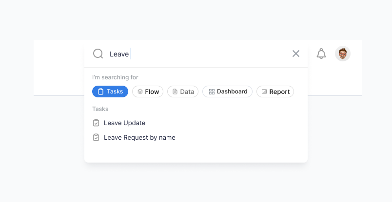
- The user can select single or multiple filters to narrow down their search results.
- The clear field button will clear all search values that were entered and the results that were shown along with it. Clicking anywhere outside the search bar will collapse the search bar.
States
Search inputs come in different states depending on how the user is interacting with it — Default, expanded and applied filter.
Guidelines
- Use descriptive placeholder text within the search input field to guide users on what to search for
- Ensure the search feature is responsive and functional across various devices and screen sizes
- Organize search results in a clear and scannable format, showing relevant information and options.
- Include loading indicators or progress bars to inform users that the search is in progress.