Live Demo

+3
Anatomy
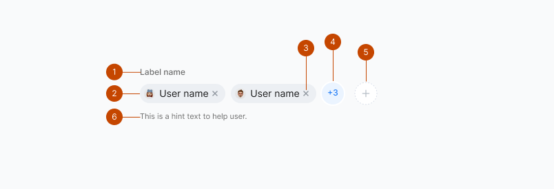
- Label
- User badge
- User badge Close
- Remaining numbers
- Add button
- Hint text
Interaction
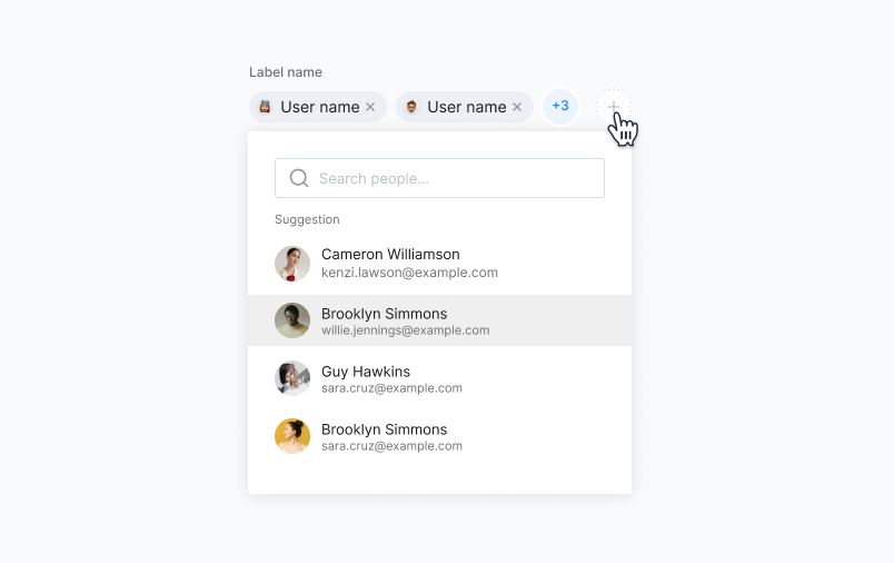
- The default state of a user picker features a plus button with a dotted circle.
- When the user clicks this button, a dropdown menu appears, containing a search input field and a list of users. This allows the user to manually search for individuals or type relevant letters, which dynamically filters the dropdown list to display users matching the input.
- Users can select one or more users or groups by simply clicking on their names within the dropdown.
- The selected users are then shown as chips with a remove (X) button at the right end. These chips are displayed above the search input, making it convenient for the user to modify the list of selected users.
- To prevent visual clutter when a large number of users are chosen, a button with a plus icon and the count of additional selected users is shown. Clicking this button expands the view to display all the users who have been added. This design ensures a clean and user-friendly way to manage user selections in the user picker.
State
User picker can have default, active, filled, and destructive states
