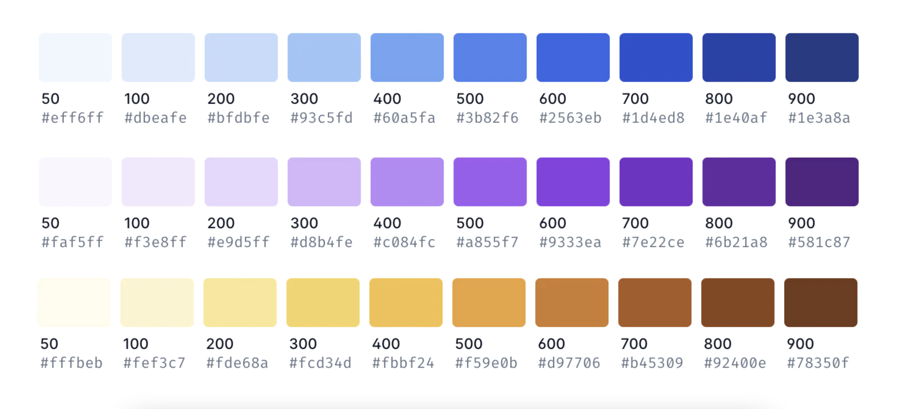
UI palette
Our color palette is a selection of colors that work together to create consistency in products.
The UI color palette for the Workhall Design System is defined by four overarching goals
Brand Consistency- Align with and reinforce the Workhall brand identity, reflecting the brand's personality, values, and visual language across all digital and print material.
Accessibility and Inclusivity -Prioritize accessibility, ensuring content is legible and usable by all users, including those with disabilities, complying with established standards such as WCAG (Web Content Accessibility Guidelines).
User Experience Enhancement - Enhance the overall user experience by using visually pleasing colors that create cohesion, helping users navigate, understand, and engage with Workhall's digital products and interfaces.
Versatility and Scalability - Be versatile and scalable, functioning effectively across various platforms, devices, and media, maintaining clarity, vibrancy, and impact in different contexts.
These goals provide a strategic framework for selecting, using, and maintaining the colors within the Workhall Design System, ensuring that the color palette serves both the brand's identity and the practical needs of users in digital and real-world contexts.
Primary colors

Action Blue / Primary Blue - In the Workhall application, the use of Primary Blue or Action Blue should be intentional and strategic, serving specific purposes within the user interface (UI). Here are some common ways in which Primary Blue or Action Blue can be used in a UI:
1. Call-to-Action Buttons:
- Used for call-to-action (CTA) buttons that encourage users to take specific actions, such as "Sign Up," "Submit," or "Get Started."
2. Navigation Elements:
- Applied to key navigation elements like primary menus, tabs, or links that guide users to important sections or features.
3. Selection and Highlighting:
- Used to highlight selected items or elements, helping users understand their current state or choices.
4. Progress Indicators:
- Applied to indicate progress, such as in progress bars or step indicators, showing users how far they are in a process or workflow.
5. Links and Interactive Elements:
- Used for hyperlinks and other interactive elements within text or content to make them easily recognizable as clickable or tappable.
6. Primary Branding Elements:
- May be used for primary branding elements, such as the company logo or brand name, reinforcing brand recognition.
7. Buttons for Positive Actions:
- Applied for buttons that represent positive actions, like "Save," "Confirm," or "Continue," indicating actions that move the user forward in a process.
8. Icons and Iconography:
- Applied to icons and iconography that represent actions or interactions, providing visual cues to users.
Semantic colors
Status, progress, validation, and interactive elements. For example, red for errors, green for success, and yellow for warnings.


Grayscale colors
Background, text, and non-essential elements to maintain readability and a clean interface. Highlight the areas where changes are made and wherever new content has been added.
