
Introduction
Design templates for workhall presentation encompass 75 fundamental layouts that pre-configure essential elements like fonts, sizes, spacing, and colors. These templates, aligned with Workhall's style guide, ensure cohesive and uniform visuals across various communication contexts. They empower the creation of limitless design variations, suitable for a wide array of purposes, such as business presentations, knowledge sharing, onboarding, and more. The aim is to maintain a consistent and professional brand image throughout all communication platforms.
Layouts and Specialised Slides for Engaging Content Delivery
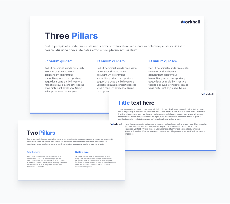
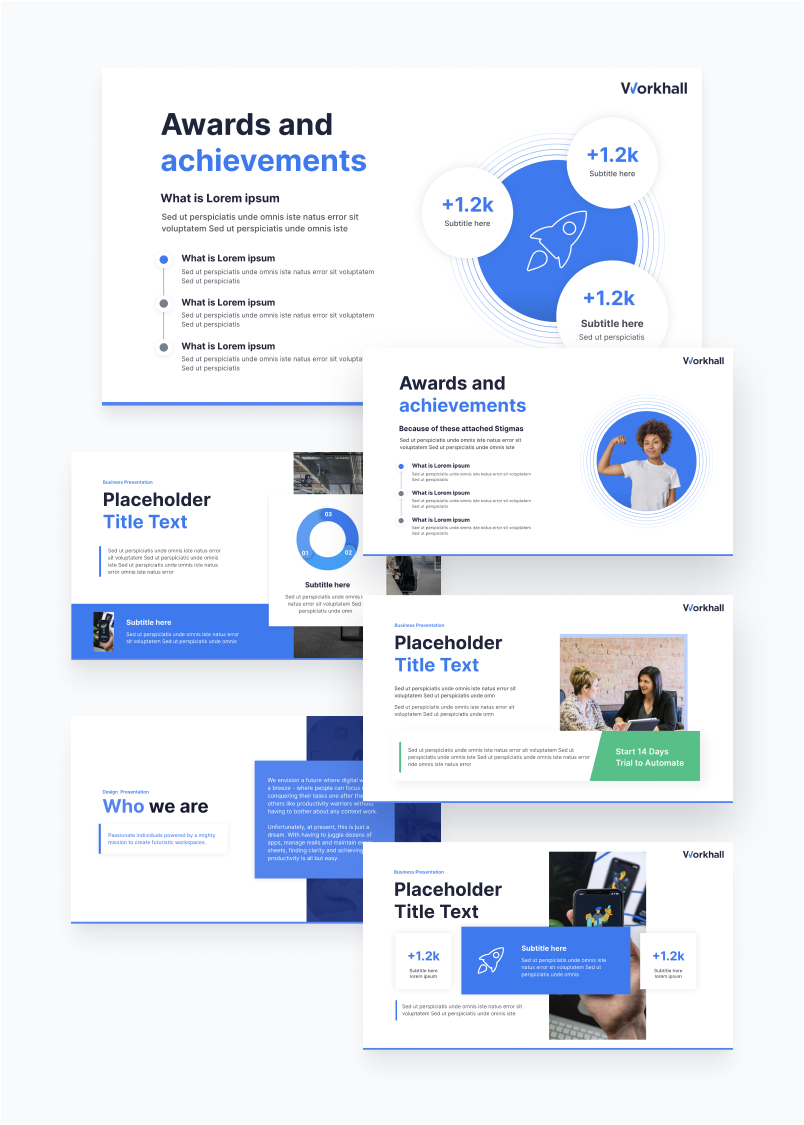
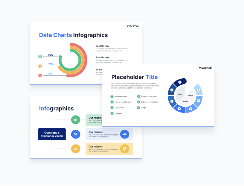
Title and content slides within our template collection offer the flexibility of one, two, and three-column layouts, with easy access via the Google Presentation link provided on this page. In addition to these versatile options, we've curated a set of specialised templates for various data representations. These include agenda slides, timelines, data and chart slides, quote slides, comparison slides, as well as timeline and infographic templates. The usage of these templates can be tailored to the specific needs of your content, your target audience, and the objectives of your presentation.
By leveraging this comprehensive presentation template collection, you can craft an impactful presentation that not only sustains audience engagement but also delivers information in a lucid and compelling manner.
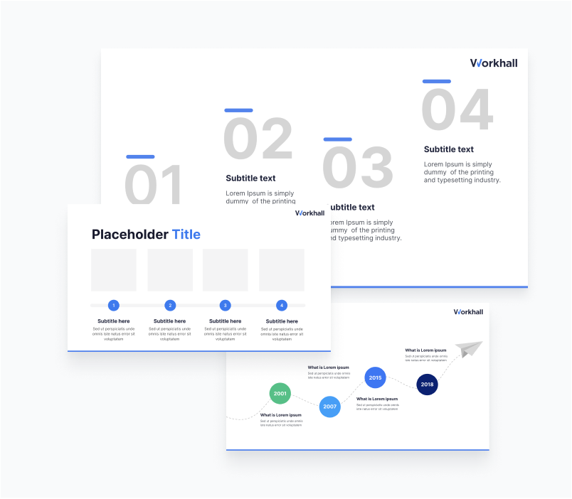
Timeline slides
Displays a chronological sequence of events or milestones, often used for historical or project-related presentations.
Timeline slides
Displays a chronological sequence of events or milestones, often used for historical or project-related presentations.
Timeline slides
Displays a chronological sequence of events or milestones, often used for historical or project-related presentations.
Guidelines for while editing presentation templates
Do’s:
- Maintain Consistency: Ensure that all design elements, fonts, colors, and branding adhere to workhall’s design standards.
- Use Clear Typography: Use only inter font and maintain consistent font styles and sizes, and allow for proper spacing.
- Incorporate Branding Elements: Include Workhall’s logos and other branding elements consistently but not intrusively
- Follow Colour Palette: Stick to Workhall’s colour palette to maintain a professional and harmonious look
- Use High-Quality Images: Select relevant, high-quality images and graphics that enhance the content
- Establish a Content Hierarchy: Utilise headings, subheadings, and bullet points to create a clear content hierarchy
- Present Data Effectively: Employ clear charts, graphs, and tables with proper labelling and titles for data presentations.
- Limit Slide Transitions and Animations: Use slide transitions and animations sparingly to enhance the message without distraction.
- Maintain Readability: Keep text concise, avoid lengthy paragraphs, and use readable fonts.
- Use White Space: Allow for adequate white space to reduce clutter and improve visual appeal.
- Gather Feedback: Seek input from stakeholders to ensure the template meets their needs and expectations.
- Provide Training: Offer training and guidelines to ensure consistent and effective use of the templates within the organisation.
Don'ts:
- Overcomplicate Design: Avoid overly complex or cluttered designs that can distract from the content.
- Stray from Brand Guidelines: Do not deviate from workhall’s branding and design standards
- Use Unreadable Fonts: Stay away from fonts that are difficult to read, especially in smaller sizes.
- Oversaturate with Branding Elements: Do not overload slides with logos, slogans, or branding elements; they should be tastefully incorporated.
- Misalign Content: Avoid misalignments, overlapping elements, or inconsistent positioning of text and graphics.
- Ignore the Colour Palette: Resist the temptation to use colours outside of our approved palette.
- Include Low-Quality Images: Steer clear of low-resolution or irrelevant images that do not enhance the content.
- Neglect Content Hierarchy: Do not create slides with equal emphasis on all elements; prioritise the main message.
- Mislabel or Leave Data Unexplained: Ensure that charts, graphs, and tables are appropriately labeled and contextualised.
- Neglect Slide Master: Refrain from creating slides without a consistent master template.
- Overuse Transitions and Animations: Avoid excessive slide transitions and animations that can distract or become tiresome.
- Present Dense Text: Do not overwhelm slides with lengthy paragraphs of text.
- Overcrowd with Elements: Maintain proper spacing and avoid cramming too many elements onto one slide.
- Don't Oversimplify: While minimalism is good, ensure all crucial information is present.